Plainmetal
Plainmetal
DURATION
1 Week
DURATION
1 Week
CLIENT
Plainmetal
CLIENT
Plainmetal
UI Design
UI Design
Animations
Animations
PROJECT OVERVIEW
PROJECT OVERVIEW
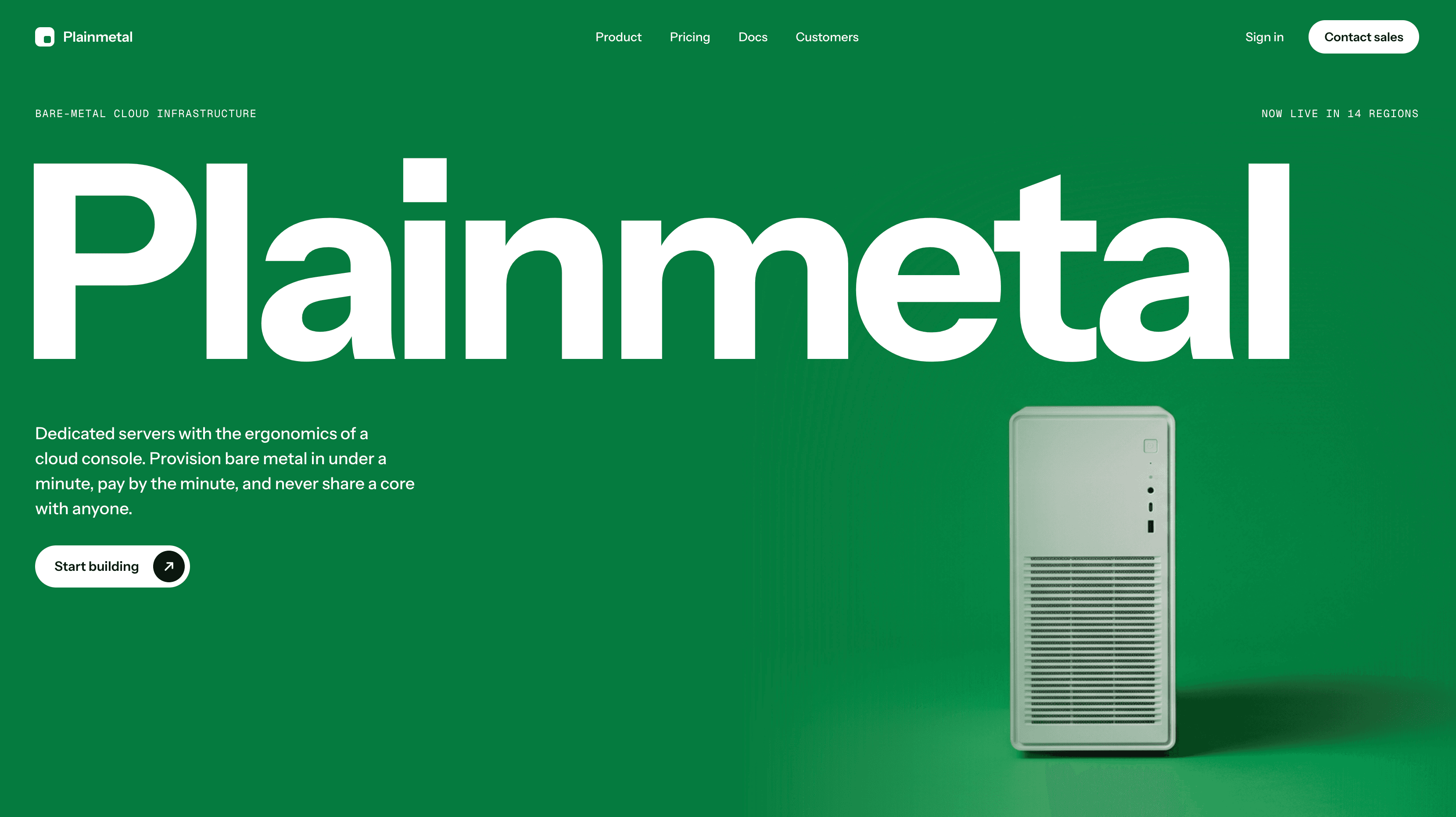
Plainmetal rents out whole computers, real servers, not shared ones, and you only pay for the minutes you use. We designed a seven page website for them: a main page plus Product, Pricing, Customers, Docs, Contact, and Sign in. The whole site uses one green, one near black, and thin grey lines.
Plainmetal rents out whole computers, real servers, not shared ones, and you only pay for the minutes you use. We designed a seven page website for them: a main page plus Product, Pricing, Customers, Docs, Contact, and Sign in. The whole site uses one green, one near black, and thin grey lines.
The Challenge
The Challenge
Most tech company websites look exactly alike: a dark screen, a purple glow, and a floating picture of an app. Plainmetal is about real machines and clear prices, so the site had to feel solid and honest instead. That was tricky, because the site is full of heavy stuff like price charts, code, a world map, and a cost calculator.
Most tech company websites look exactly alike: a dark screen, a purple glow, and a floating picture of an app. Plainmetal is about real machines and clear prices, so the site had to feel solid and honest instead. That was tricky, because the site is full of heavy stuff like price charts, code, a world map, and a cost calculator.


The Challenge
The Challenge
Most tech company websites look exactly alike: a dark screen, a purple glow, and a floating picture of an app. Plainmetal is about real machines and clear prices, so the site had to feel solid and honest instead. That was tricky, because the site is full of heavy stuff like price charts, code, a world map, and a cost calculator.
Most tech company websites look exactly alike: a dark screen, a purple glow, and a floating picture of an app. Plainmetal is about real machines and clear prices, so the site had to feel solid and honest instead. That was tricky, because the site is full of heavy stuff like price charts, code, a world map, and a cost calculator.

The Challenge
The Challenge
Most tech company websites look exactly alike: a dark screen, a purple glow, and a floating picture of an app. Plainmetal is about real machines and clear prices, so the site had to feel solid and honest instead. That was tricky, because the site is full of heavy stuff like price charts, code, a world map, and a cost calculator.
Most tech company websites look exactly alike: a dark screen, a purple glow, and a floating picture of an app. Plainmetal is about real machines and clear prices, so the site had to feel solid and honest instead. That was tricky, because the site is full of heavy stuff like price charts, code, a world map, and a cost calculator.
The Challenge
The Challenge
Most tech company websites look exactly alike: a dark screen, a purple glow, and a floating picture of an app. Plainmetal is about real machines and clear prices, so the site had to feel solid and honest instead. That was tricky, because the site is full of heavy stuff like price charts, code, a world map, and a cost calculator.
Most tech company websites look exactly alike: a dark screen, a purple glow, and a floating picture of an app. Plainmetal is about real machines and clear prices, so the site had to feel solid and honest instead. That was tricky, because the site is full of heavy stuff like price charts, code, a world map, and a cost calculator.


