Pulse
Pulse
DURATION
1 Week
DURATION
1 Week
CLIENT
Pulse Gyms
CLIENT
Pulse Gyms
UI Design
UI Design
App Design
App Design
Design Systems
Design Systems
PROJECT OVERVIEW
PROJECT OVERVIEW
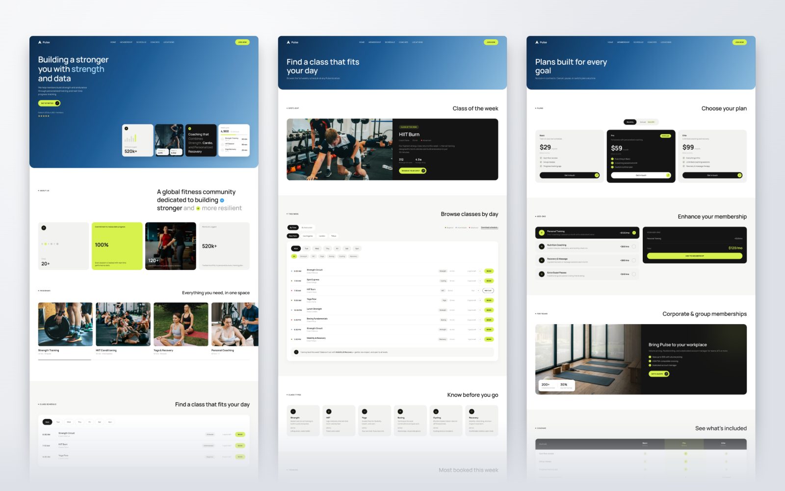
Pulse is a global performance-fitness brand with 20+ studios and a companion training app. We redesigned the marketing site's hero and built out the full landing page — programs, live schedule, on-demand library, membership, locations, community events, and app download — in a single cohesive system.
Pulse is a global performance-fitness brand with 20+ studios and a companion training app. We redesigned the marketing site's hero and built out the full landing page — programs, live schedule, on-demand library, membership, locations, community events, and app download — in a single cohesive system.
The Challenge
The Challenge
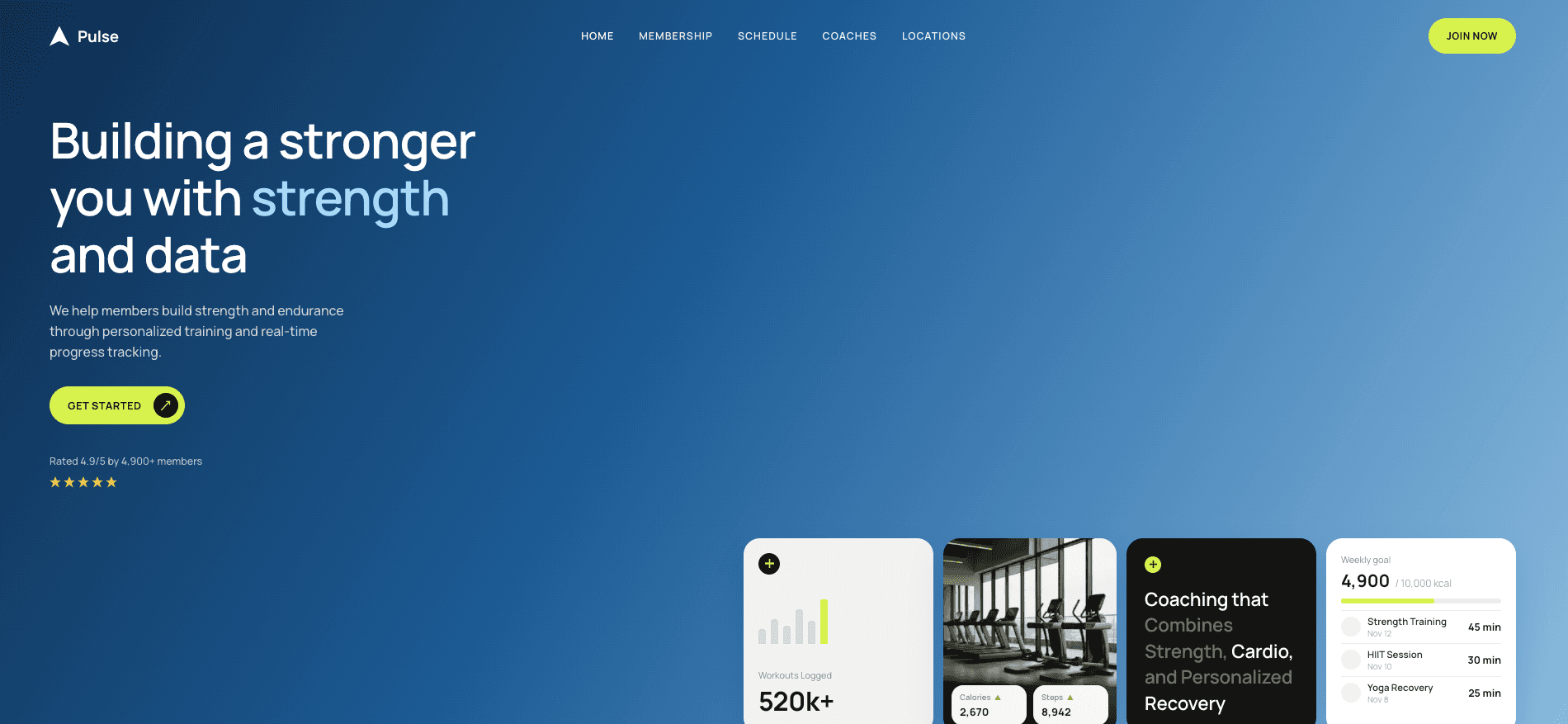
The original hero leaned on a heavy navy gradient and flat placeholder graphics, so the product's core promise — measurable, data-driven training — never actually showed up on screen. The page also had to feel premium and editorial without drifting from the existing app's visual language, which the brand already ships to members.
The original hero leaned on a heavy navy gradient and flat placeholder graphics, so the product's core promise — measurable, data-driven training — never actually showed up on screen. The page also had to feel premium and editorial without drifting from the existing app's visual language, which the brand already ships to members.


The Challenge
The Challenge
The original hero leaned on a heavy navy gradient and flat placeholder graphics, so the product's core promise — measurable, data-driven training — never actually showed up on screen. The page also had to feel premium and editorial without drifting from the existing app's visual language, which the brand already ships to members.
The original hero leaned on a heavy navy gradient and flat placeholder graphics, so the product's core promise — measurable, data-driven training — never actually showed up on screen. The page also had to feel premium and editorial without drifting from the existing app's visual language, which the brand already ships to members.

The Challenge
The Challenge
The original hero leaned on a heavy navy gradient and flat placeholder graphics, so the product's core promise — measurable, data-driven training — never actually showed up on screen. The page also had to feel premium and editorial without drifting from the existing app's visual language, which the brand already ships to members.
The original hero leaned on a heavy navy gradient and flat placeholder graphics, so the product's core promise — measurable, data-driven training — never actually showed up on screen. The page also had to feel premium and editorial without drifting from the existing app's visual language, which the brand already ships to members.

The Challenge
The Challenge
The original hero leaned on a heavy navy gradient and flat placeholder graphics, so the product's core promise — measurable, data-driven training — never actually showed up on screen. The page also had to feel premium and editorial without drifting from the existing app's visual language, which the brand already ships to members.
The original hero leaned on a heavy navy gradient and flat placeholder graphics, so the product's core promise — measurable, data-driven training — never actually showed up on screen. The page also had to feel premium and editorial without drifting from the existing app's visual language, which the brand already ships to members.


